Shot with Zero 2000 Pinhole
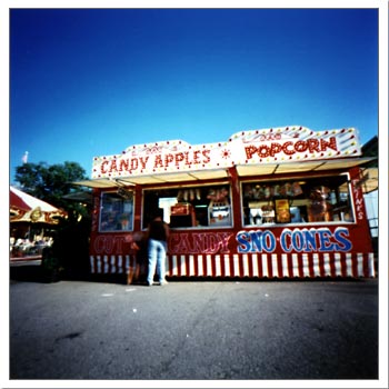
Got my C.N.E photos back yesterday. They definitely make me want to go back for a second round of picture-taking. With the first photos I wasn't sure what I was going to get and now I know what worked and what didn't.
I've been hyper about going to the C.N.E every year to take photos because I'm certain those rides and concessions stands will not last forever. In fact I have noticed some of the good "old stuff" disappearing over the last few years. Believe me I would go to other carnivals with old rides if I could drive. I just love old parking lot carnivals.
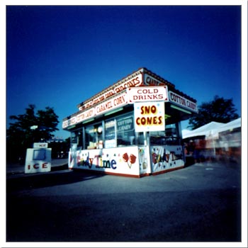
You know, something I hate to see is when they fuck up the look of something old and well-designed by adding some new crappy design element to it that doesn't match. The "Sno Cones" concession stand above is an example. The older design of the structure has been (in my opinion) defaced by the badly designed "Candy Time" banner that wraps around the base. Mr. Risk and I often refer to this phenomenon as fifties/eighties syndrome. In the eighties there were many references to fifties design popping up here and there. The show "Saved By the Bell" is a classic example. They used the confetti motif popularized by fifties era linoleum in both the opening sequence and in the design of the diner. But what a mess! I think we can all agree that, that was some nasty stuff.
The same thing is happening with that "Candy Time" banner. They're "sort of" referencing the style of the text treatment at the top. Why couldn't they have just gone a little further to make it match?
It's not right I tell you! Not right! Let's end bad design mixing.
Comments (2)
What you see and read here.
© 2003 a human